Two Paintings
Nocturne: Blue and Silver – Chelsea
Nocturne: Blue and Silver – Chelsea
Recently, I stumbled on a font I had seen many times before. But now, I was really seeing it.

Created by Steve Matteson and Carl Crossgrove in 1995 for the Agfa Monotype Corporation, Curlz was a whimsical, swirling, thing that tried to look homemade but didn't quite stick the landing. As noted here, the swirls are too uniform to have been made by a pen, and the overall top-heavy strokes create an unsteady feel. Some strokes that feel like they should be thick are thin, and vice versa. It's not a great font. Even the creator thought so. Nevertheless, I have a weird love for it.
This fuckin youtube channel, man.
I turned off recommendations, so I can't watch youtube shorts, but i still see and click on them below regular videos. My fixation on cooking content brought me here, to a channel detailing various foods being prepared by villagers. Everyone in the comments counts how often certain words like "basalt slab" are mentioned, and celebrate accordingly. Including me.
We give thanks to the villagers for their paste.
I'm known as the "Flamin' Hot" person in my family. No one else likes hot stuff. So when i buy it, I get it all to myself! :3€
Some good spicy foods:
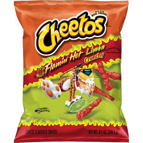
The original hot Cheetos aren't my favorite, but lime makes them better.
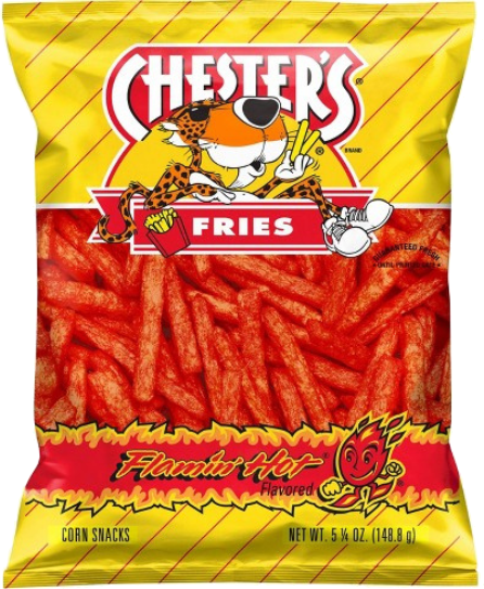
Moving upward are the hot fries, which I eat two at a time. I like the softer texture and flavor.
Could eat ten bags. I'm reminded of how Tracy Wan described rhubarb as "a taste that calls for more of itself."
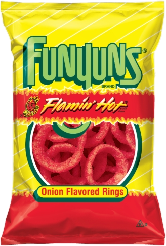
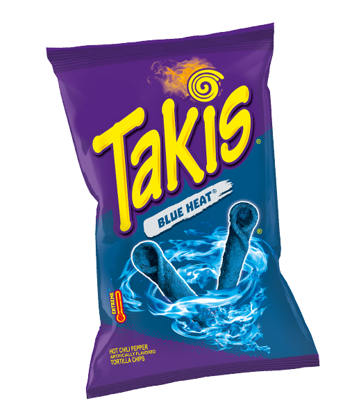
My fav of all Hot Chips!!! They're hard to eat (wide, crunchy) and even harder to find. Very pungent.
Now, onto non-chip offerings...
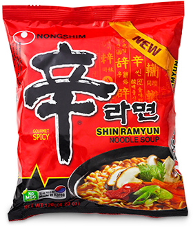
Tried it for the first time because someone left it behind at a party. Hot af, but so good. Acidic, which I like.
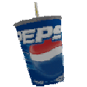
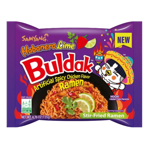
Went through a phase in 2023 or so where I ate this every night. Watching jacksepticeye horror playthroughs while slurping away is a strangely peaceful memory. Now I need to spruce it up with peanut butter, but still a classic.
My favorite for chips and salsa. It's so sweet and just hot enough.
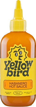
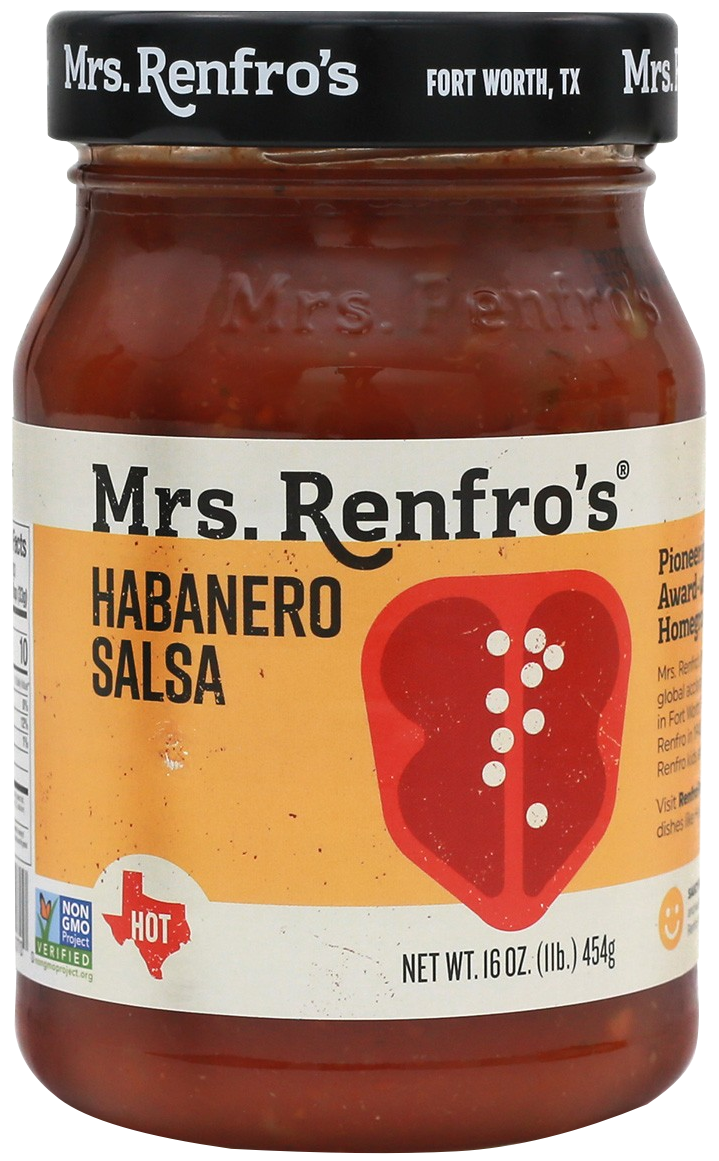
Tried this at a friend's house--I think it's one of the best hot sauces I've ever had.
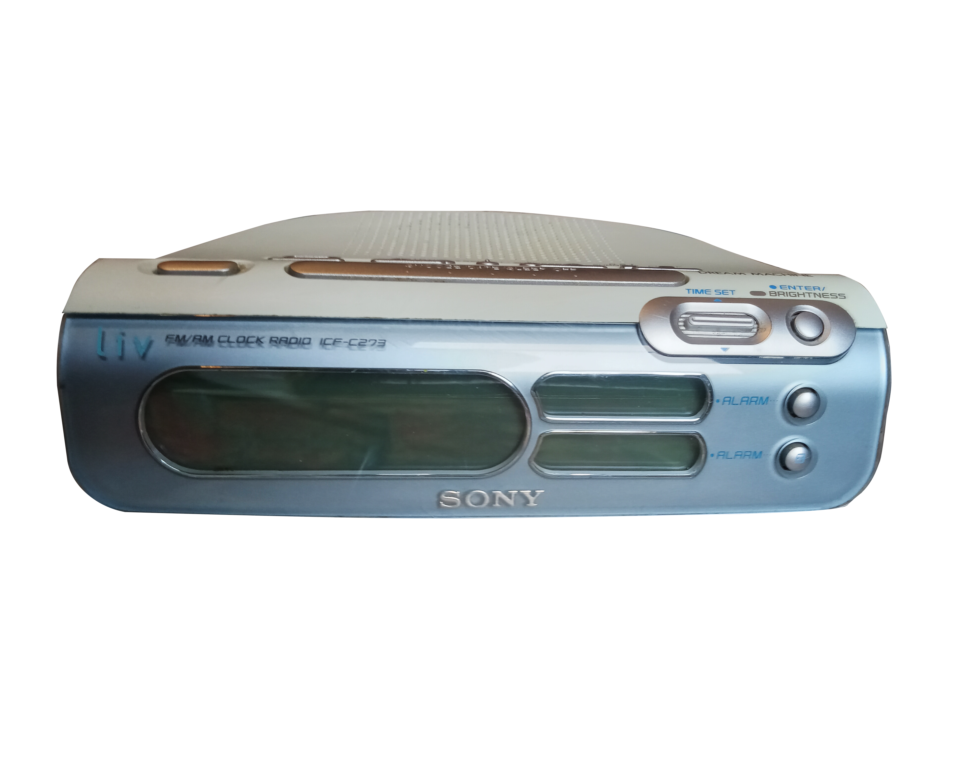
In my Quest to Get Away from Phone, I have enlisted the help of the delightfully Y2K Sony Dream Machine ICF-C273. Manual is here. Or here if you want the PDF directly, which I stole from ManualsLib. I needed to look at it, because I haven't touched a radio since my dad listened to sports commentary every morning driving me to school. The presets don't work on it, but everything else is in good shape. I haven't used the alarm function yet, but I'll report back when I do. I was able to look up a bunch of local radio stations and wrote them down, so I could navigate to them quickly in the absence of presets. It's been really nice reading physical books without needing to have my phone on for background.
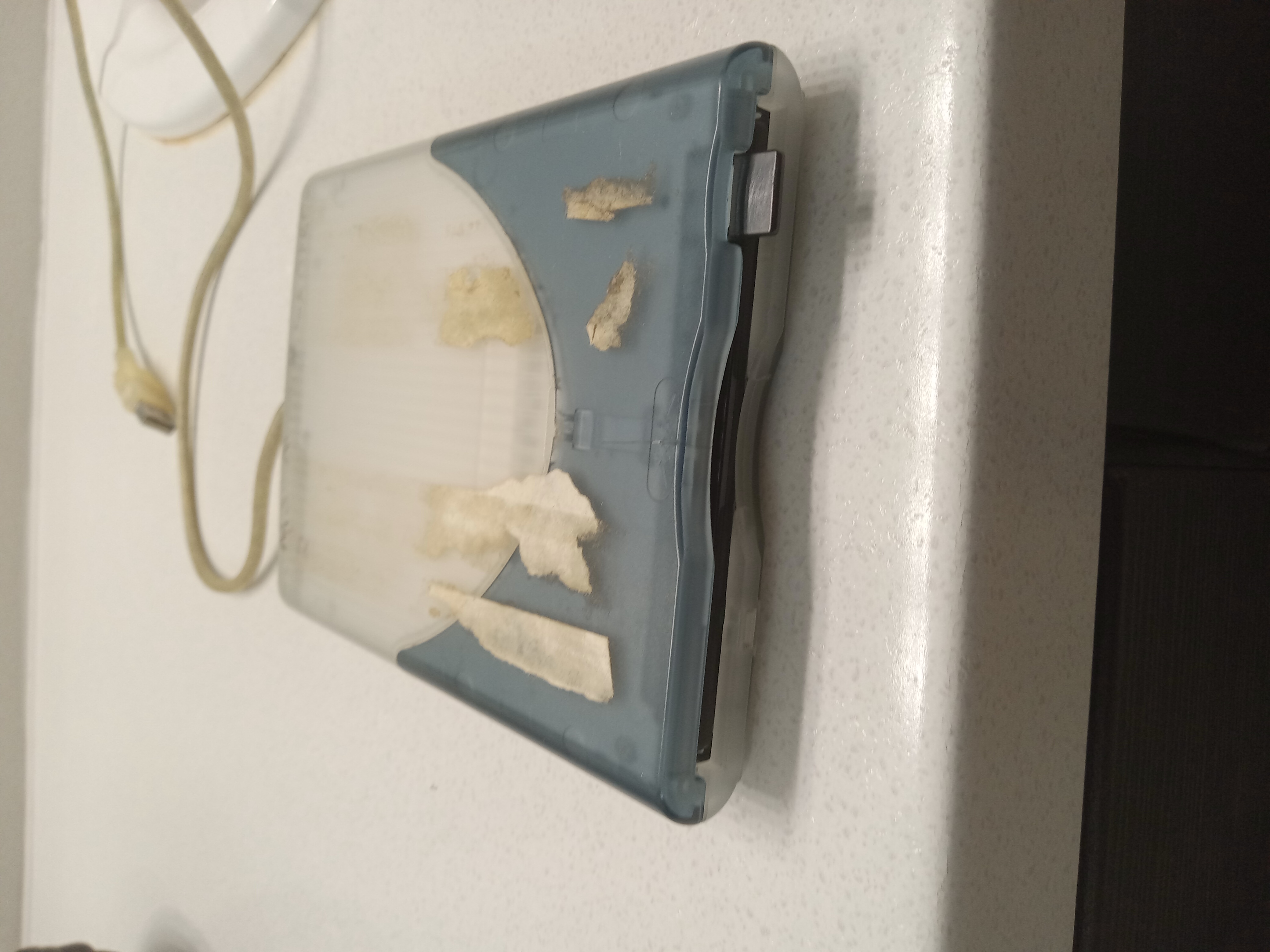
Look what I was correctly able to operate at my girlfriend's house! It keeps a lot of fun tech hanging around, including this floppy disk drive. I thought using it and the corresponding disk was going to be way more complicated than it was. You just slide that sucker in and push the switch on the side to pop it out. Neat!
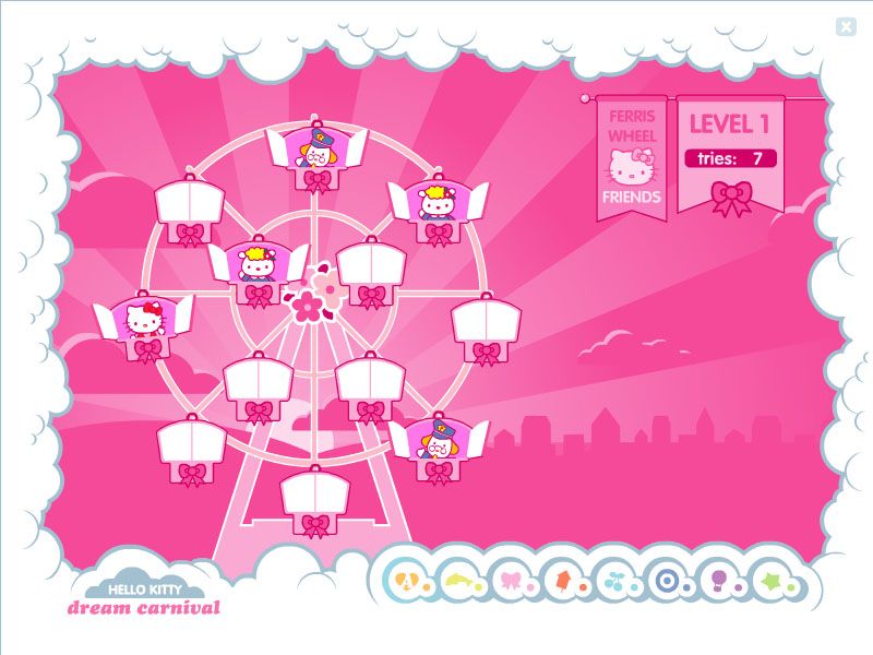
I have a vague, positive memory of a Hello Kitty game I used to cue up on my father's laptop. Turns out, it was pretty easy to find. It's called Hello Kitty Dream Carnival. You can find out absolutely nothing about it at this baffling Google Arts and Culture link.
Upon looking at screenshots (courtesy of Moby Games) I remembered my actual favorite game within the collection: Rainbow Smoothie Coaster.

I liked food games, although I never played the Papa's Pizzeria games or anything like that.
*Or tolerated. I got my first phone fairly late, in the summer of 2012. It was suggested that I have one in case of emergencies since I’d be going to middle school soon. I haven’t been free since.
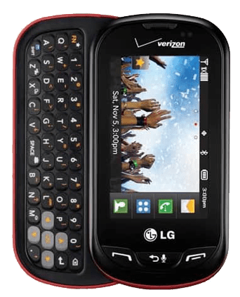
My beloved. I would force in my earbud jack every day before school and listen to the Cinematic Orchestra’s “Arrival of the Birds” and “Transformation” at the lowest sound quality you could imagine. It’s still my favorite song, even more so that I can actually hear what’s going on. If it fell out of my hands, it would break apart on the tile, and I’d be able to put the batteries back in and attach the two sides of the case together and it would be as good as new. I still have pictures of my old cat Onyx on it. I left it at my father’s friend’s house, and he just bought me a new one instead of going to get it.
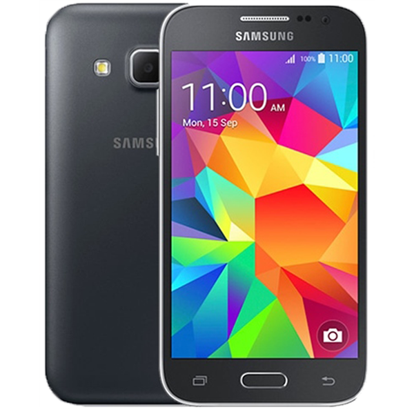
Also my beloved. The release date means I must’ve still had that Extravert on the first day of high school, which is very funny. I remember the relief of now having a touchscreen, like all the other kids. This docile creature served me all throughout high school and beyond, until 2019. I didn’t believe it until I checked my Google Photos and saw pictures taken with it that year, making it the longest-lasting device I’ve had so far. Even the geometric lock screen fills me with nostalgia. I had this phone when the iPhone 10 was making its debut and being fawned over by my friends from my video class. I think that was my anti-Apple awakening.
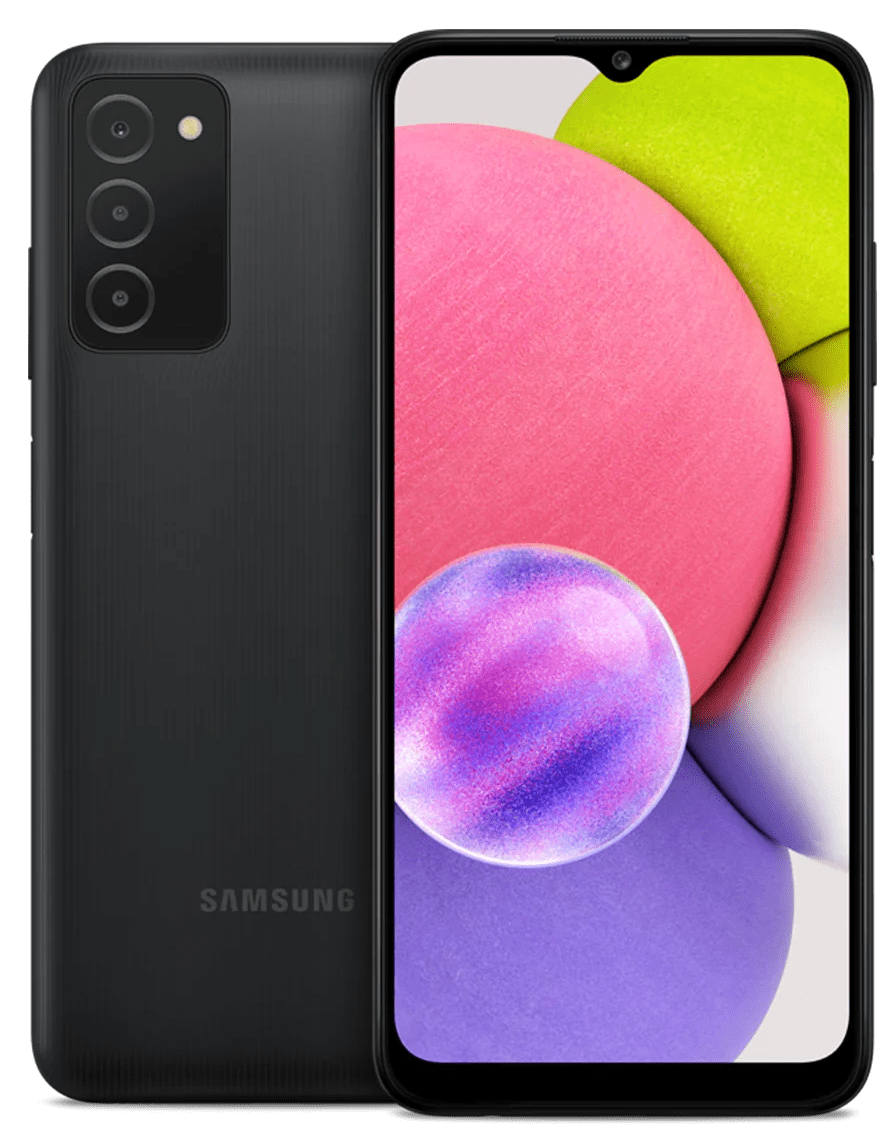
We switched over to Visible Mobile (a subset of Verizon) in 2019, probably around October. The R2 is free if you switch, and you can definitely tell. It was fast and easy to set up, but the battery lasted two years, the latter six months of which was spent trying to keep my phone above 30% so it wouldn’t shut down. Dishonorable mention to my stepmother’s R2, which I had to switch over to and lasted even less time.
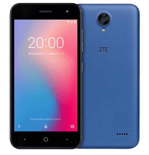
My current phone is the cheapest available that would accept Visible’s new 5G plan. It has an unfortunate Android 11-era bug, that being that it restarts whenever it feels like it, sometimes in the middle of phone calls with my therapist. Oh, and it didn’t come with a charging cable or block. But other than that, no complaints. I hope it lasts.
I used to collect Lip Smackers, more broadly lip balms. I got up to 76 in 7th grade, and took my bag of them with me to class (I was really, really cool). My holy grail was Strawberry Grapefruit.
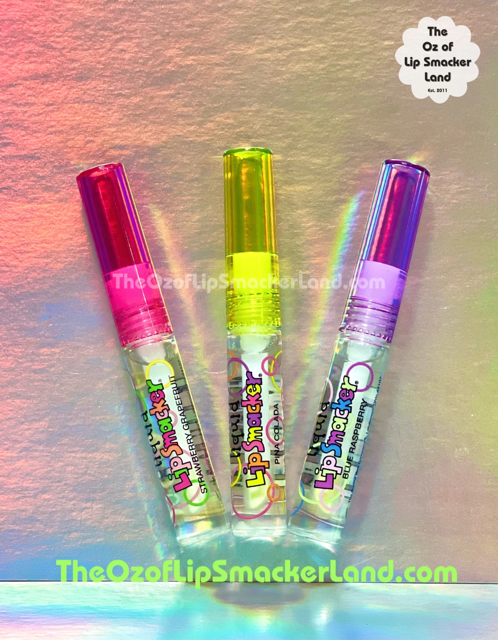
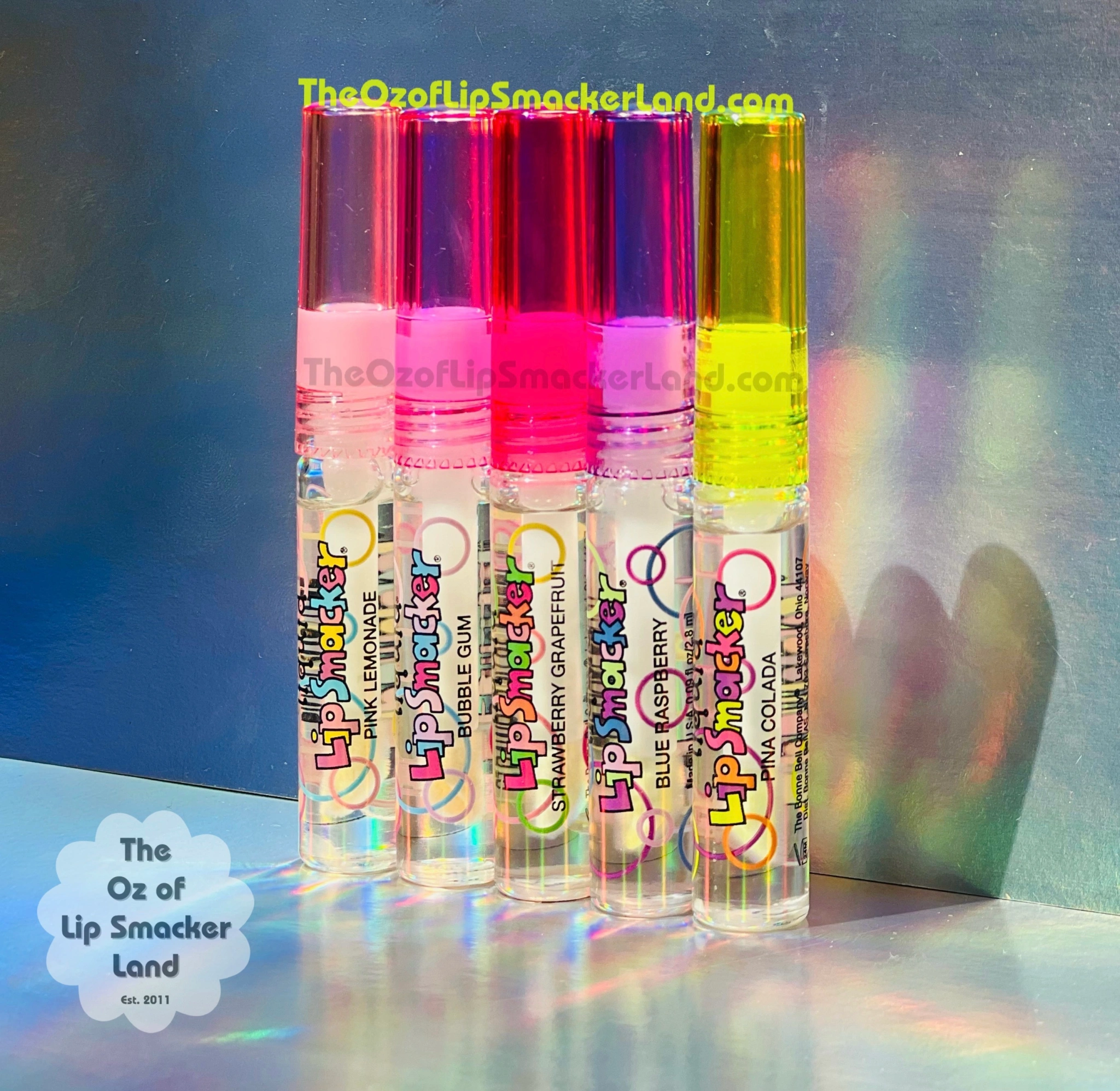
It baffles me that this flavor was so unpopular as to leave little trace. Only a few collector blogs seem to know anything about it. It was sour, strong, sweet, but not too sweet. I would wear it now. It leaned into the grapefruit smell and away from the strawberry. The texture was silky, clear, and youthful enough for me to wear as an eleven-year-old without feeling like there was goop on my lips. I remember packing it in a tiny bag and smelling it on my first-ever flight to my grandfather’s house, listening to Above and Beyond’s Sirens of the Sea album. It smelled like citric acid. Like Sour Patch and Toxic Waste and skin peeling off my tongue. Like the “margaritas” my cousins and I used to make at our grandmother’s in-house bar, which consisted of lime juice and sugar in fancy glasses. Maybe I should get myself checked for Vitamin C deficiency.
My friend calls it 'angry water.' I consider it to be excited water. Here are all the kinds I've had, ranked in order of enjoyment.
Fourth, San Pellegrino Essenza.
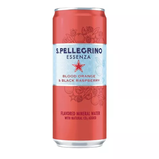
If you, like me, ordered some while trying to get the regular kind, you will find nothing but bitter disappointment. Even if you measure your expectations, there's no way around the fact it tastes like uncoated hydroxyzine. Like tonic water. If you like that, good for you, but I don't.
Third, bubly.
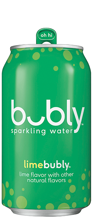
I never understood how my father could taste hard and soft water. I had been spoiled by hard water my whole life. How could water taste slimy? Weak? I get it now. Bubly doesn't really fizz, it trembles. You will wonder if it's gone flat. It hasn't.
Second, Kroger.

I have a can right next to me as I write. It sends my bowels into a tizzy, but it's lovely in the mouth. The flavor isn't much to write home about, but that's never the case with sparkling water.
First, LaCroix.
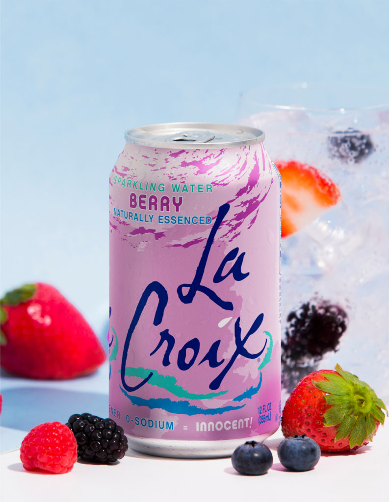
Meme on it all you want, I know the truth. Perfect level of fizz, adequate amount of flavor, pretty can (I'm an aesthetics person). I have no idea where the "fruit in the next room" thing came from--if I wanted strong flavor, I'd go for soda. Or the Essenza. This doesn't ask too much of me, and in turn relieves my dehydration headache and makes my tongue feel funny. What more could you want?