Another Liminal Find

Thanks to Justin Chrn on Unsplash for this one!

Thanks to Justin Chrn on Unsplash for this one!
This bunker has haunted me since I saw it on Reddit as a teenager. Final boss of liminal spaces. Someone (Girard B. Henderson) decided to make this in the wake of the Cuban Missile Crisis. Jay Swayze was the actual architect, and built another underground home for Henderson in Colorado and one for himself in Texas. They even did an exhibit at the 1964 World's Fair pitching the underground home idea. It flopped. Thankfully, we still have this bunker.
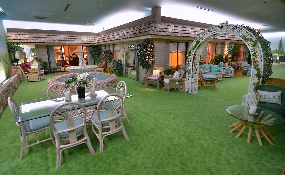
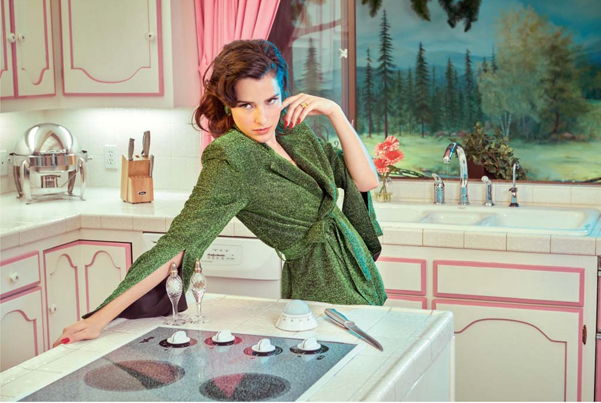
It's liminal because it imitates the familiar imperfectly. Not to style on a mural painter from the 60s, but the murals are less-than-photorealistic, which is what I would expect in this case. The shots from the inside of the house are fine, but once we see the plastic tree-pillars and the Disney-concept-art murals, it's all over.
Was playing Geoguessr the other day and got placed at 21°23'16.9"S 41°01'44.0"W. I name it as such because there's not much nearby.
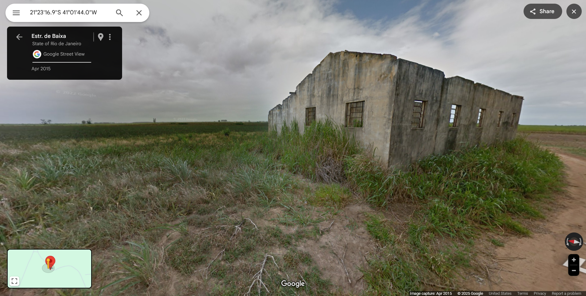
The street is called Estar de Baixa, and if you follow it, you'll hit some more ruins.
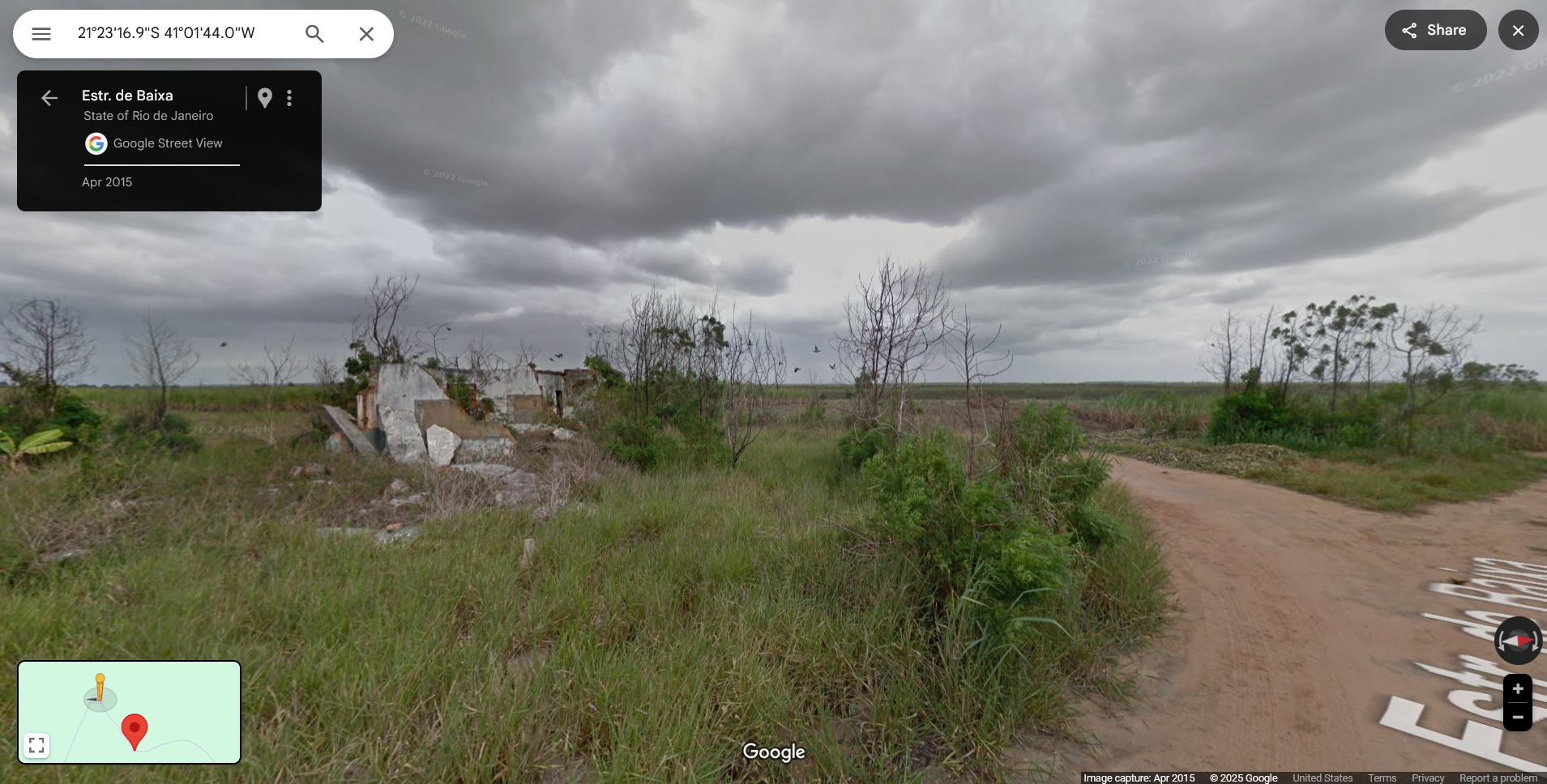
I think this feels liminal to me because there's evidence of human activity (the ruins and street themselves, the lined-up fields), but it feels deserted. I doubt it actually is, but it is in this photo.
I’m weak to aesthetics centering around water. Some of my happiest childhood memories were in waterparks. Not the ocean, though. I had been to the ocean once and I didn’t like it. But pools, hot tubs, chlorinated and free of living things besides myself, I loved. The smell of chlorine, the blue, the plastic. I used to bite pool toys for the texture. This gif has that same texture.

I want to lie down in that river and let it carry me like a trout. I want to inhale so much chlorine that it kills all the strains of COVID that are probably in my body. I want to climb the fake trees and promptly fall on my ass because they look really slick. I would waste hours here, and I’m twenty-three. I wonder if you can climb on those clouds? I never was much of a climber. Or swimmer. Or runner. Or anything that involves moving. But those clouds are my personal rodeo horse.
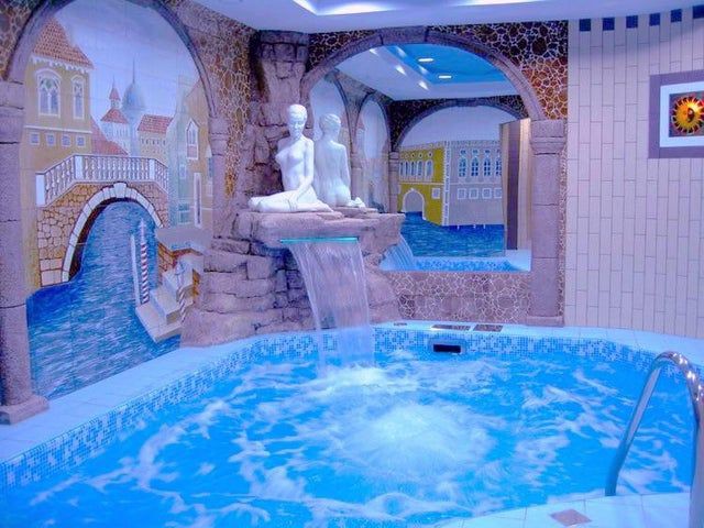
I can see my stepmother stepping in, foot by foot, then starting Decor Discourse with my father. How tacky! I’d tune out, touch the rocks, avert my eyes from the statue (temptations of St. Anthony), and giggle about the warmth and fizz on my toes. This has the same potency as the previous. They’re both facsimiles of outdoor life, like that one Cold War-era bunker. The claustrophobia of the tub’s position against the wall and the recreation of Venice gives it cursed energy that the other two scenes in this post don’t have.
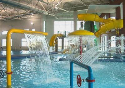
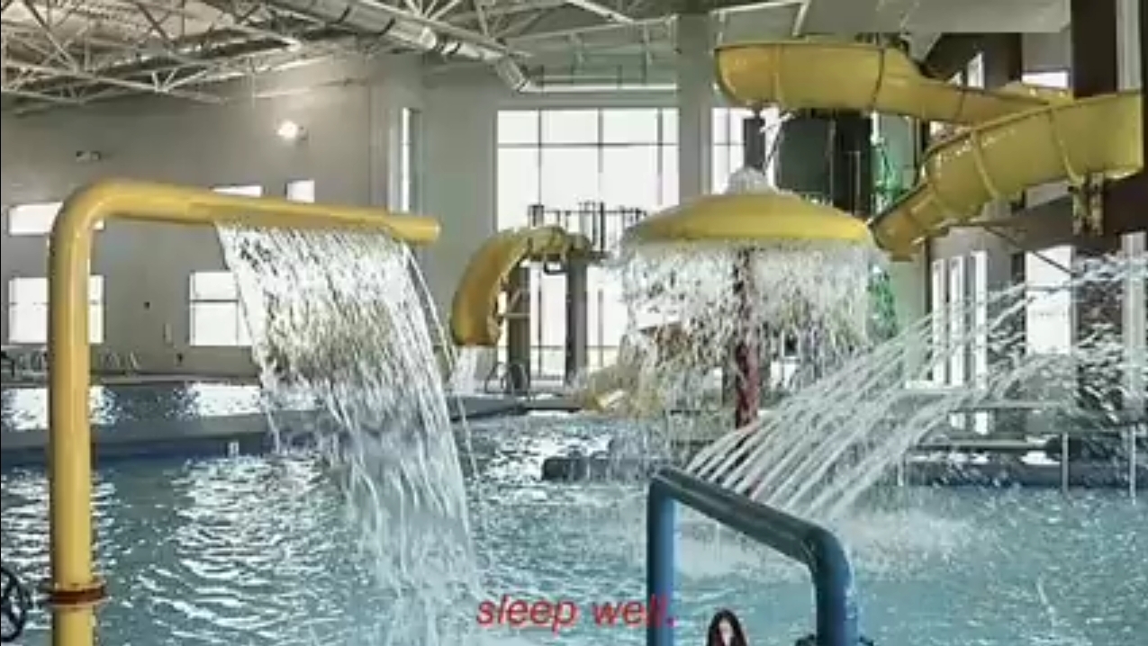
I’ve never been to a YMCA, but this makes me feel like I’m missing out. This was the first image that made me sit up and pay attention to this liminal space trend. I’d watch other kids spin those wheels (too scared to mess with things myself) and wade through the water, possibly on hands and knees, like a lizard. I’d shut my eyes against the dribble of water from the mushroom thing, then rub them dry once I climbed out.
These scenes are more comforting to me, but they have that edge of unease and nostalgic aura that makes them my favorite!
You probably know Gabrielle Traversat from this photo.
Or this one.
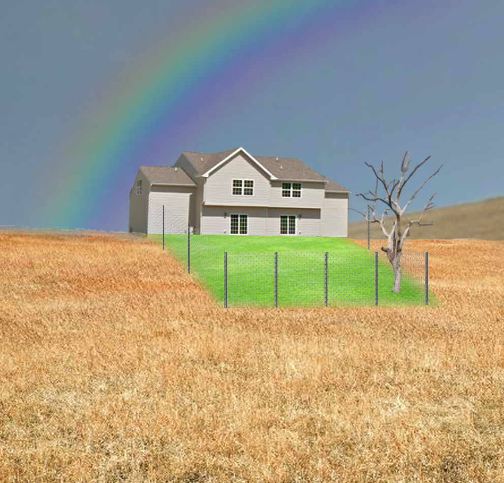
I wanted to show you more of her work, though you can find all of it on her art blog, @gbrltvrst on Tumblr, or @spectrometrie on Instagram for people that prefer normal social media. Though she makes art more inspired by Old Web aesthetics as well, I'm focusing on her more liminal-space-y art today.
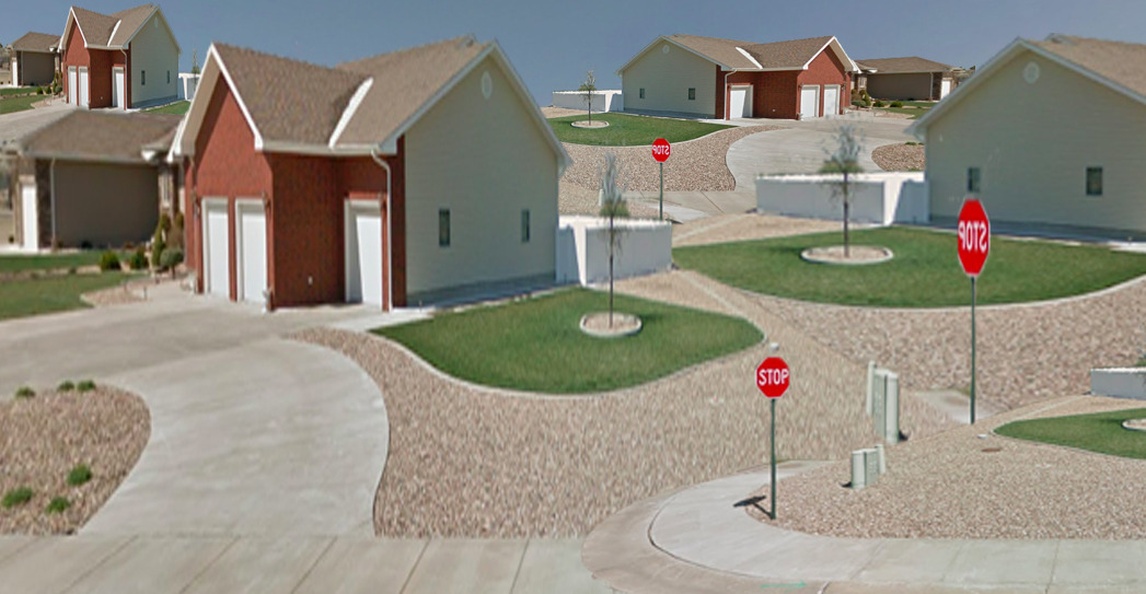
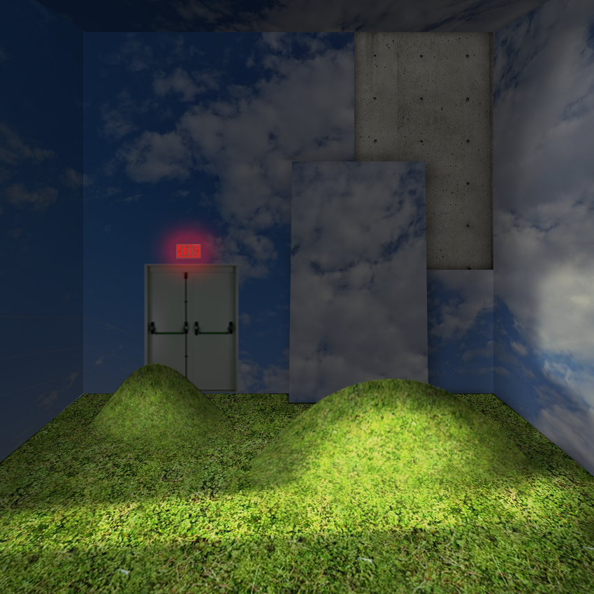
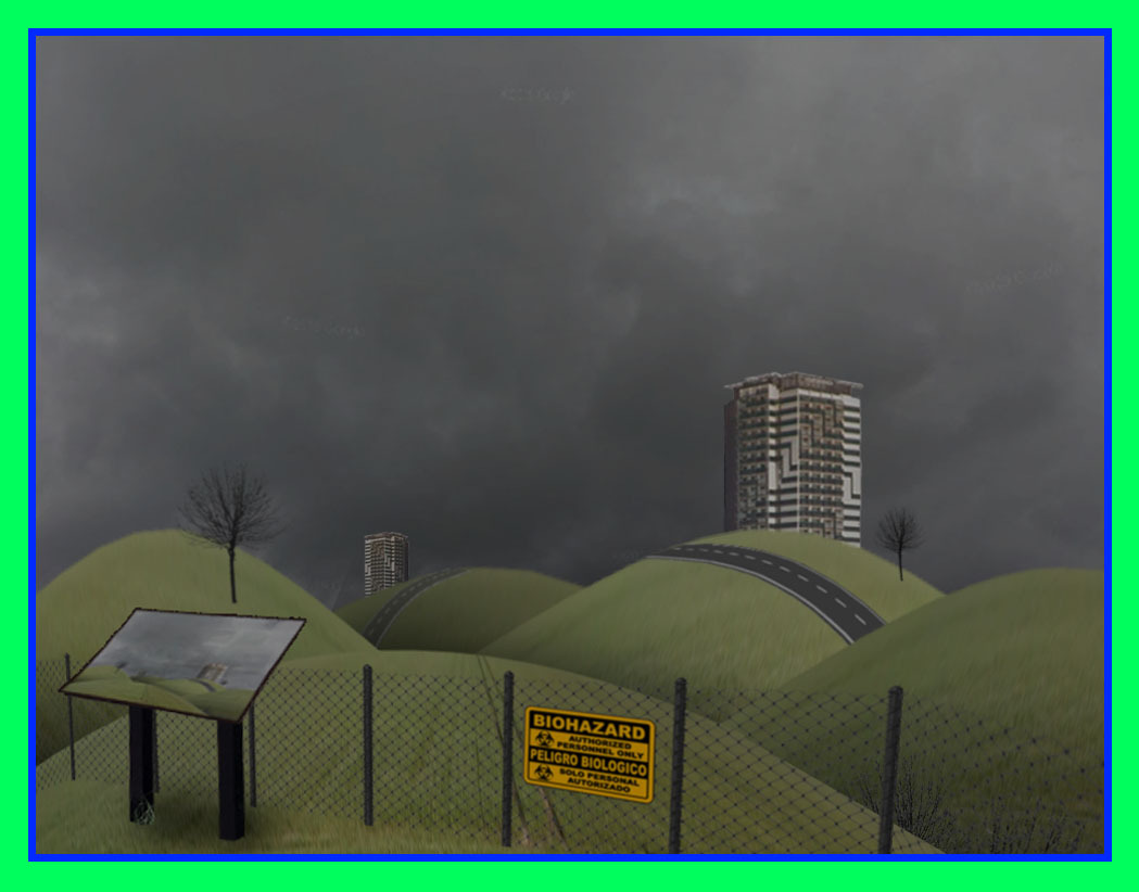
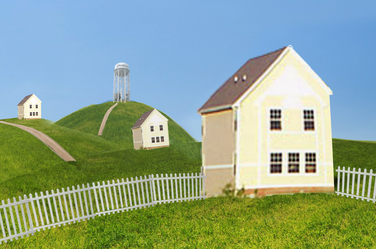
These images make me shiver. The boxy houses, spindly water tower, and exaggerated topography are all common in her work. The ground looks like a PS2 texture, also common. If you touched it, it'd be flat. It's a puppet show.
Obviously, liminality is subjective. But I'd like to throw up some ideas as to why I think her art is so popular. Why it "works." Almost like a written video essay that's three minutes long.
These pieces borrow from Traversat's own photography as well as Google Maps, with Photoshop being used. The elements are real, or as real as the camera can capture. That realism is important, so the image has something to deviate from. In the first image, the houses are blurrier than the hills they sit on. In the fourth, they're sharper. These real elements are placed incongruently. It's real, we know it is, but it doesn't 'fit' with what's around it.
This brings me to lighting. More specifically, the lack of strong shadows. Shadows tell you about form. A lack of shadows means a lack of information--think of an overexposed shot of the face. All you see are irises and nostrils, a line of the mouth. These images mimic that effect, not by blowing out the values in one direction, but by pushing them all towards the middle.
Not only are the shadows spare, but they don't match the environment, much like the quality. In the first image, there's no shadows at all. In the second, there's a shadow beneath the ledge on the house, implying light coming from above. However, no shadow is cast from the house onto the grass, and neither the green nor brown grass get darker as they turn away from the light source. In the third image, there's a short cast shadow, but it stops at the grass. Certain planes that should be lit--the side of the house on the far right of the image--are not.
The fifth image is an exception. I believe this gives it a different feel than the others. An eerie hopefulness. The EXIT sign, grass texture, and painted cloud panel missing from the wall imply that this light, too, may be a trick.
The lack of people, signs, and captions all work together to give you zero useful information. The third and fourth images read, "suburbs," and "neighborhood," respectively. The fifth image reads, "this one's not ready yet." Also, could be my bad eyesight, but the EXIT sign is difficult to read. The sixth has a sign that says BIOHAZARD: AUTHORIZED PERSONNEL ONLY. These words and signs gesture at the gap between what these images are supposed to look like versus what's presented. The EXIT sign is in a place that looks like the outside but isn't at all. The "neighborhood" has three houses, each a continent apart from the other, with no roads or paths between. The "suburbs" are a maze. These bits we're given pull double duty by making the image applicable to more people and confusing the viewer more. The BIOHAZARD sign puts to mind gutted apartments, mutated animals, so the normal-ish landscape is jarring. Why is it a biohazard?
The common thread here is ambiguity. Though some of the individual parts are real, their configurations are not. It makes your brain jump back and forth. There's the suburb where you grew up, the house in the cartoons you watched, the bright green lawns, your most elemental memories. Then there's the distorted proportions, the backwards STOP signs, the sunless sky, to remind you instead of a dream.
Notable quotes (with the in-text citations taken out for readability):
"It begins with a review of the uncanny valley, a phenomenon describing the negative appeal (usually eeriness or creepiness) of stimuli that deviate from familiar categories."
"The effect is not specific to human entities: artificial animals and manipulations of realistic animals elicit observable uncanny valleys."
"...domain-dependent explanations explain uncanniness through mechanisms specific to human or animal processing, and include avoidance of disease indicators, avoidance of genetically unfit mates, avoidance of potentially psychopathic traits, and dehumanization."
"According to Kaplan’s model, a high degree of mystery (defined as hidden, but 'promised' information about an environment) may be elicited by surroundings not allowing inference of sufficient information, motivating further exploration. Stamps found that dim light and visual occlusion increased the mystery of physical places, which the researcher interpreted as increased informational entropy or lack of environmental information."
"Visual complexity of an environment, defined as information richness, affects likability of an environment in an inverted U-shaped manner."
"Thus, uncanniness was neither associated with disgust sensitivity (disgust hypothesis) nor ambiguity tolerance (ambiguity hypothesis).
"Hallways were more uncanny than non-hallway places across all stimuli."
"In total, a place’s uncanniness has been most often attributed to indicators of spatial deviation like a lack of features or emptiness, distorted sizes or proportions, feature displacement, and repetition of features or patterns. In addition, uncanniness has been most often attributed to lighting or lack thereof, lack of safety, hostility, or threat, and unknown, uncertainty, or a lack of purpose. Visual occlusion or lack of people was mentioned relatively rarely.
"Thus, all types of distortion increased uncanniness, as well as social absence."
"Humans neither distracted from, nor normalized spatial anomalies. However, social presence either increased or decreased the uncanniness, oddity, abnormality, and threat partially depending on whether humans would be expected."
