GVC Find!
I was watching Friends with my partner, and Noticed this:

Does it count as GVC if it's literally a coffeehouse or no

I was watching Friends with my partner, and Noticed this:
Does it count as GVC if it's literally a coffeehouse or no
So I found this tweet.

Huge anemoia moment for me. GOD, it's gorgeous.
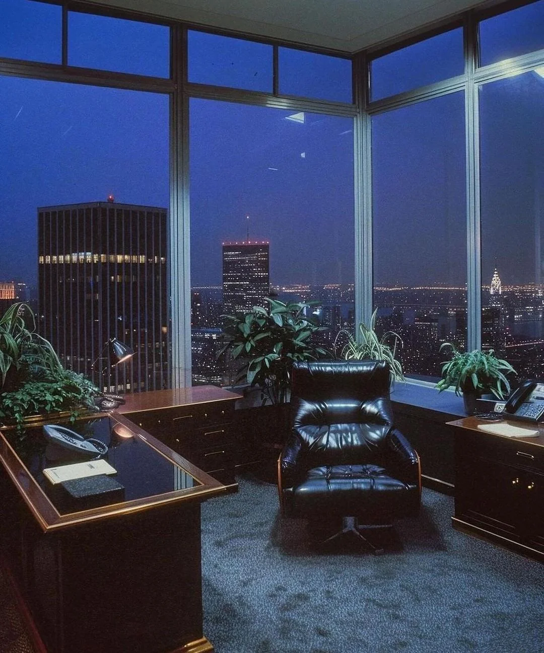
This reddit post seems to share in this feeling.
Unfortunately, it seems to be AI. This comment here points out the illegibility of the phone on the right, and how the lamp on the left seems to shapeshift into it. I'm rather ashamed I didn't catch this. I feel like I should've. The perspective of the back-left building is a little off--the leftmost side of that building should taper down more sharply to a vanishing point. The rightmost leg of the spinny chair lacks the "pedal" the others have. None of the results from Reverse Image Search are older than a year, Tineye most recently indexed it in 2024, Yandex is Pinterest all the way down, etc.
However, normal images can have weird quirks too. Especially art. Famously, perspective is hard. We forget things. It's more of a tell in photography, but with older photography and viewed in limited resolution, the telling gets harder. I guess it's time to accept that you're gonna be fooled sometimes, and not to get too bummed out or defensive about it. AI generated works can be very convincing. Whether they're "good" is a matter of personal taste. Often, I think they are! Good art ≠ good artistic process or artist. We all know this. This image, for instance. There's cool colors, a Vaseline-coated lens that flares the highlights, a healthy amount of grain to give it that vintage feel. The strong top-down lighting creates drama. The left desk, right desk, and chair have a hierarchy to them. The space in front of the chair and site of high contrast draw your eye there, then to the left, then to the right, then to the pretty skyline in the background. This would be a good shot.
So what now? Accepting the above. I decided to look at what inspired this look. First, by checking out the aesthetics recommended here. This is what finally forced me to google what Art Deco was instead of going off of vibes btw. Decoplex and Deco-luxe were both design trends that revived Art Deco's geometry, stark contrasts and streamlining and took them in a more playful and luxurious direction respectively. To me, there's a lot of focus on symmetry, taking natural motifs and moving them towards abstraction through simplification, and a sense of grandeur conveyed through these dramatic choices and luxurious materials like glass and metal. Cruise lines, film studios, the United Nations! You can definitely see elements of that starkness, that grand design, in this image. However, the aesthetic that fits this image the most is Geo-Glam. I found this last, by looking through Evan Collin's catalogue. It is sometimes referred to as "cocaine decor." I vote we call it that forever, for what it's worth.
Been looking into the Global Village Coffeehouse aesthetic, which I find very comforting. Here's what I've found and been able to synthesize so far.
The 80s started out as a very brown decade, according to this post here--a leftover from the 70s. If we follow the 20-year trend cycle, that would mean that brown came back in in the 90s. It's also not a stretch to assume the ubiquity of brown in the 90s was a reaction to the brighter colors of the 80s as well as the "computer aided design boom." It's definitely not a stretch to assume that GVC, with the focus on nature and togetherness, music and dance and an arts-and-crafts ethos was a reaction to the unchecked Reagonomics and computerization of the 80s. "In the magazines, it sounds like people are super guilty. It’s like Boomer guilt for the 80s or something about the way that they were acting—the excess and overconsumption and lack of care for the environment. The 90s shift leads to this new, huge wave of styles like Global Village Coffeehouse and what we call Eco-Beige or Eco-Rustic."
My parents came of age in the 80s, but they started buying in the 90s. They lived through this blowback.My house in the 2000s-2010s was laced with the marsala-mustard colors and aged-paper art we associate with this aesthetic. The walls of my bedroom were tan. The floors--hardwood--were also tan. Bumpy throw pillows with bubbles of beige and crimson sat on our wine-colored couch. Everything had a map on it. "The Cosmopolitan" and "Time to Shop" by Karen Dupre hung to the left of my bed.


While these works don't read as GVC to me, there are some common elements. Muted colors, presence of wildlife, the "...flowing curvy figures." I also think her art has things in common with the 'Shoe Diva' style


However, when you look at some of Dupre's other art, the influence becomes more clear. There's the squiggles! The jewel tones! The resistance to straight lines or strong rendering, both of which might read too 'European.' Upon looking again, this art includes not just "tribal/ancient imagery and iconography" but a fascination with non-European aesthetics and subjects. This is further elaborated on in a pair of videos by @venusstadt, now @thisisjiana on Youtube.
As an aside, the first video blasted me back 15 years by showing me the Eyewitness intro animation. Behold!
It goes without saying that this aesthetic borrowing was not always mindful. Jamba Juice as a whole is very GVC, with the focus on health and wellness and natural ingredients, as well as the iconic swirl logo they got rid of and replaced with a worse one. The name 'Jamba' allegedly comes from a "West African word for 'celebration.'" Which West African language it comes from, we may never know. I checked the source with help from archive.is, and the original NYT article does not elaborate.

I think you can see reflections of this even in later times, with the Frutiger-Metro-looking redesign you see later. When Jamba Juice became Jamba during the simplification boom of the 2010s, even the typography took on a softer, more squiggly look, to the acclaim of some,, including myself, who thinks that the new typography fits better with the logo's vibe.
More stuff. On the CARI page for GVC, there's these three images.


They're all labeled "The Earth (YNL)." I tried to find the source for weeks, but this Reddit thread, as it so often is, ended up being the answer. It's a beer hall, debuted by the Suntory company to celebrate the release of their "The Earth" beer in 1990. There's a Washington Post article linked in the thread, but it's pay/accountwalled, so here is the archive.is version. I find the ending to be on-topic. The use of environmental motifs by a huge corporation. "'In a word, it's laughable,' said Kenichiro Kobayashi, a senior staff member of the Japan Union for Nature Conservation."
Here's another beer hall by Suntory, for fun :]
One last thing (I say, two 'last things' in). A modern example.

Their whole product collection is like this, with a Kokopelli-evoking logo. Their "Our Story" page reads, "Presently, we’re actively satisfying our clients’ growing social consciousness in the areas of preserving & protecting our environment, sustainability of natural resources, healthy lifestyle, and personal development." Sounds GVC to me! Their kid's olive oil (???) even has a Remedy-style typeface.

I have this towel at home that I love.

I can't tell how recent it is, but given the designs on the website here, I'd guess 2000s-2010s.